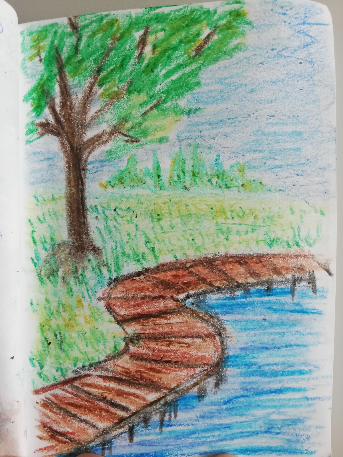
Wooden path. Done in crayons. Just to see what I could do with them. I wish my crayon skills were on par with LemiaCrescent from youtube, but I'm nowhere near her level. Still not gonna stop me from trying. Problem is, my crayons don't seem to want to layer. Oh well, I'm gonna be vacationing in the UK this year so I'm gonna try to get my hands on some art supplies that are not available in my country. Including some Crayola crayons, just to see if they really are better than what I have.

This time, I took out just a normal pencil. And then I got inspired and decided to draw a tree while watching some "how to draw" videos on youtube. I love the fence. Yet, I'm a bit disappointed with the top of the tree. The rest of it is good, but the topmost part, not so much. Still, altogether, a nice sketch. Well, not a sketch, a drawing this time. Too detailed to be a sketch. For once.
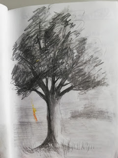
Another tree done in pencil. This one
can and will be classified as a sketch. I did not spend enough time on it to be anything but a sketch. Still like how it turned out. Love the shading of the branches and the tree trunk. Though I did almost tear through the paper with the pressure I was putting on the pencil. Well, that's what I get for using such a flimsy paper.
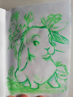
Pants this time and it's a bunny. Mostly just an outline with a bit of shading in the darkest parts. And some flowers in the background. Oh, and he's green because I had some leftover green paint and didn't want it to go to waste.
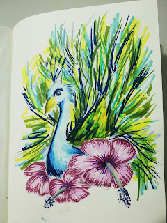
Peacock done in markers. Water-based markers, I must add. At least di did not use the flimsiest paper I had. The sketchbook this is done in has paper that is a bit sturdier. Not as good as my mixed media pad that I still haven't used, but better than the one I did the bunny on. Not that the bunny had problems, but you understand what I mean, don'T you?
The problem with this was, even though the paper was of better quality, I still had some problems when I layered too much marker on top of each other. And then I started bitching about not having enough green shades. So the next day I went to buy some. And now I have a bigger selection.
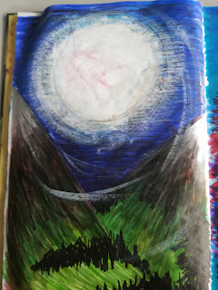
Moon valley. Done in markers mostly, but the moon is white acrylic paint that was half dry on the palette. I started this several years ago. And this year, I came back to it. It's in a book that has almost every page filled with an unfinished picture. There are a few that are already finished, but I'm honestly not sure if there are any empty pages left. Maybe one. But I don't know for sure. My prediction is that it will take quite some time to finish it. In most cases because I have zero idea what I was doing on some of the pages. Really, some of them have several random lines or similar and I have no clue what it was supposed to be...
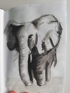
Elephant. In gray paint. Just a quick sketch. Wanted to try animals and had leftover black and white paint. Or maybe just black? I don't know. It could have been white for all I know. But I know I had leftover paint of some kind. I love how the elephant turned out. Also, initial sketch was done in pencil that was then partially erased with a kneaded eraser.
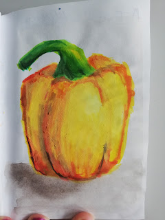
Bell pepper. In yellow. Done in water-based markers. I love how it looks. Though again, the flimsy paper. I feared I would tear right through it. I didn't though. Love the shading on it. Like, I know it's not hyperrealism, but I still want to grab it and eat it! And now I'm wondering if it really is done in markers. Because I think it actually isn't. Or at the very least, it is a combination of paints and markers. Still, looks great and I love it.
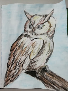
An Owl. Hoot hoot. Well, not Hoot Hoot. That would be a pokemon. Done in paint and colored pencils. Really like how it looks. Though if I wanted, I could go back into it and make it a lot darker and more saturated. I won't, though. I think I like it the way it is. So why mess with something that works, right?
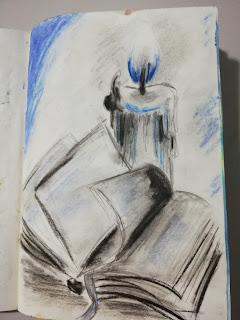
Who left a burning candle right next to a book? Done in pencil initially. But then I decided to add some color and took out my oil pastels and giocondas. I mean, who doesn't like blue fire. I sure do. So I added mostly blue, but also some black and gray for shading. And for the record, the photo doesn't do it justice. It looks kinda better in real life. I guess it's because the photo is not lying flat and is not front and center... I'm
not taking another one!
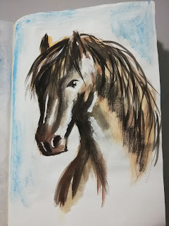
Horse. Don't know why. Maybe as a homage to my horse phase when I was younger? There was a time when I would draw a lot of horses of any kind. And I still like them, but I'm no longer so crazy about them. That's what I get for entering a dragon phase.
Well, nevermind. This stallion is done in paints and I love how he turned out. Now to figure out what breed he is. Any ideas?

 I was watching a charcoal tutorial on youtube. It was about drawing an eye. But the main problem was, that my charcoal was not the smudgy type. So I had to take out my soft pastels, which I coincidentally, only have in black, white and gray, and try to see if they would work. And boy, did they! They worked wonders. I mean, the iris could have used a bit more highlights, but oh well, it still looks cool! I love how it looks! Done on an A4 paper with some tooth to it. The sketchbook it's in was a Christmas gift. :D And so far, it's working pretty well for me.
  This one was done while I was watching some youtube video about basic proportions. It was all about measuring and comparing distances. And the guy is like still doing the nose while I'm googling hairstyles. Basically, remember what's-his-name from the post titled "Who the fuck are you?"? Well, this was a similar process. Just this time, I did a female, just like him. But the end result is completely different. The size is a fourth of an A4 paper. Done in a basic pencil that I don't even know the hardness of, but it seems like it could be a standard 2B pencil. Or something like that. Well, anyway, I'm happy with how this looks. What do you think?
 Heh. Frankly, I don't even know what to say about this one. I mean, it's not horrible, but compared to the other two, it's like a complete noob drew it. And maybe it's because it was done in oil pastels and on a rather small paper. So I couldn't really fit enough detail into it, but still. The hands are pretty horrible. Though my thought process is this: If I don't draw them, regardless of how horrible they are, I'll never get better at drawing them. So that's why I'm posting even this. It's not my best work, but it's not my worst either, so there you go. Tell me how bad it is. I can take it.