 |
| A sewer rat. Done with paints. Though I might have done some sketching with a pencil first. Also, this is done on an extremely crappy paper. But hey, I just wanna fill that sketchbook and it's one where I don't care if I mess up. So that's great about it. In the background, my former keyboard is visible. It was great but it stopped working. I now have an even better one that was actually cheaper too! So great. Hope you like it and see you next week. ~AnnElfwind |

...cause what's the world without hell...
Showing posts with label Paints. Show all posts
Showing posts with label Paints. Show all posts
Wednesday, February 16, 2022
A Plague Rat

Wednesday, September 8, 2021
And sometimes I paint
 |
| Just some doodles of flowers done with paints. I love the one in the pot. Looks really cool! What do you think? |
Written on the 11th of August, 2021
Wednesday, July 28, 2021
I hate Spongebob
 |
| Why did I draw Spongebob when I hate him? Rough sketch done in pencil, outline in a variety of brush and fine liners. Spongebob is done with oil pastels, the rest is acrylic paint. I mean, I love how it looks, I just hate the subject. But the random generator decided for me so I had no power over it. |
Wednesday, September 9, 2020
A Cat, A Hand, And A Forest
 Hello everybody, I got three new pictures for you. I also have to write this on my notebook's inbuild keyboard and it's a pain in my neck. I prefer an external keyboard but I didn't want to bring that monster of a thing with me. So I have to make do with this one. Oh well. So, the first picture is a painting of a Cat that Got the Canary. She's looking way too smug for anything else. It is done with acrylic paints on a canvas board. I first painted the background with a pastel shade of green and let it dry. Then I got out my brown, white, and yellow paints. Yes, yellow. And I'm glad I added it. It brightens the cat considerably. Oh, and she almost didn't have front paws. I forgot about them. But then I remembered and added them. More of an afterthought but at least I didn't forget altogether. Like I did when drawing this dragon picture. I forgot the back wing. And then I had to add it. And re-photograph it and re-upload it and it was a pain. So I'm glad I didn't forget this time. Really good thing that, as this painting was a gift for my aunt. So you can't call dibs!

And now the last one. This one had inspiration from Pinterest. I even saved said inspiration on my inspiration blog. On Pinterest, it had the name of Forest of No Return and I really liked the name so I kept it. My version of the picture is decidedly less realistic and I think it strays into impressionism. still, I like how it turned out and I think that's the important thing.
It is done with water... Nope. It's done with alcohol-based markers. Because I had several Tombow markers and I even pulled out my Tiger markers to add deeper black and add the blue tones to make it look more winter-y. It may be a little weird, but I still like it. Also, the white on top of everything, that's my acrylic paint marker. Basically, something like a Posca Pen, but it only exists in white, gold, and silver as far as I know. And I only own the white one. I had two thicknesses, but the thin one died on me. So I'm stuck with the medium one, but so far, it's working when I need it to. It's not like I use it that much. Most of the time, I add highlights with white acrylic paint anyway. So it can die on me too if it wants to. But it is a little more convenient for when I don't want to pull out all the stuff I need for the actual paint...
So that's it for now. Hope you like them and if you do, let me know in the comments below. And even if you don't, let me know what I should work on to improve. Okay?
~AnnElfwind
Wednesday, July 1, 2020
The Light of Music

Bite me, I know it's a weird name, but I also think it fits. Because! That's not the moon, it's a light created by the music of the flute. I found some inspiration for this on Pinterest. I mean, the elf playing the flute is something that was on the original and all, but everything else, even the different details, that's different. The original was vastly different. It was more along the lines of a broody elf in darkness with a flute. And this one, I added the element of magic!
Whatever. I just really like how this turned out. Oh, and about the rocks! It's just splashes of black, white, brown and green. In random combinations. And yes, I know that the flute light is on the wrong side, but hey, I added that as an afterthought. So I decided that, as it is magical light, it just doesn't illuminate the elf. That there is another source of light somewhere off to the right. So yes, magical light for effect only. Because it looks cool. Do you like it? Tell me what you think? Please? I haven't gotten any new comments in ages... I want some.
Whatever. I just really like how this turned out. Oh, and about the rocks! It's just splashes of black, white, brown and green. In random combinations. And yes, I know that the flute light is on the wrong side, but hey, I added that as an afterthought. So I decided that, as it is magical light, it just doesn't illuminate the elf. That there is another source of light somewhere off to the right. So yes, magical light for effect only. Because it looks cool. Do you like it? Tell me what you think? Please? I haven't gotten any new comments in ages... I want some.
~AnnElfwind
Written on the 21st of May, 2020
Wednesday, April 15, 2020
Painting with Charcoal
 So, been a while since I posted anything. About a week? Well, actually, it's been longer. I pre-prepared most of the posts you've been seeing. But now I got some free time so I decided to post more. And again, it's some pictures I drew and painted. This first is just a "study" of a nose. Just some practice with charcoal to see what I can do and how the sketchbook I was using would perform with charcoal of all things. Lately, I got really into charcoal and I'm doing a bit of experimenting here and there.
All in all, I'm pretty happy with how this turned out. Only, the tutorial I was following, somewhat, was using toned paper so that kinda screw with it but oh well, I wasn't gonna hunt down toned paper just for a quick sketch. Maybe for a full drawing, but not for this. Also, this sketchbook seems like it won't let the charcoal be smudged as much as I would like to, but I'm learning how to work around that. So we're good.
 This next one is a painting I did that was inspired by Bob Ross. Again. Most of my nature-themed paintings are inspired by Bob Ross lately. Not all, but most. And this one, well, I really like the big tree and the smaller trees on the left side. I also love the grassy area but I'm bit bummed out about not doing the sky first, as this created a sort of a glow around the trees and bushes because I couldn't get too close to them with the blue without going over them. So, they're glowing. I'm also not too happy with the water, but that's my own damn fault for fucking around with a fucking fan brush. But I just wanted to test it out! So sue me!
 Last one in this batch. Painted before the nature-themed one but is in the last place because upload positioning is a bitch and I uploaded the other one first. So it was first. This one was done following a Paul Priestley tutorial on youtube. Well, somewhat. I didn't have the exact colors so I made do with whatever I had. Also, I did not follow his instructions on the direction of the strokes because I think horizontal ones make more sense on pottery. Also, I don't understand how green equals blue with light shined on it, but oh well, there's a lot of things I don't understand when it comes to Paul Priestley tutorials. And not in the way that I'm a beginner, but in a way where it simply doesn't make sense. So sometimes, I'm not even trying to understand anymore.
However, I like the finished look of this. The only thing I would have done differently is the shadow. I really don't like how that turned out. Still, doesn't mean I'm gonna go back in and fix it. Not now when it's all dry and finished and done with. It's just something I know I will do differently if and when I draw/paint something similar in the future.
Written on 14th of April, 2020
~AnnElfwind
~AnnElfwind
Tuesday, March 24, 2020
Mountains
 I got a set of canvases for Christmas. One is still unused but the second one now has mountains on it. Bob Ross inspired mountains to be precise. Yes, it's not exactly like the one he made, but he said I could do whatever I wanted! So I did.
The trees were a pain and a half as I didn't have a fan brush. Now I do and I hope that the next painting I do will be better. I mean, this is good, don't get me wrong, I really like it, but the trees! I made them work somehow, but I still think they would have been better if I had a fan brush.
So, I bought that today. Two to be exact. As well as two different sizes of canvas boards. And I saw tombow markers. And that's not something you really see a lot here in CZ. So I had to buy some. But they are really expensive so I only bought black and two shades of gray as I think you can do a lot with that selection. And gradually, I'm gonna buy more. Well, depending on how well they work. We'll see.
Now, back to the painting. Bob had some bushes in the foreground, but I had too much water and it was too bright so I did just some flowers on a patch of green grass. Oh yeah, the major difference between mine and Bob's is that mine is done in acrylic paints instead of oils. I really didn't feel like mucking around with turpentine. That stuff stinks. Like, I don't really mind, but others do!
So I hope you like the painting and hopefully, there will be more. :)
~AnnElfwind
[Written on 27th of February, 2020]
Tuesday, March 17, 2020
A bunch of pictures
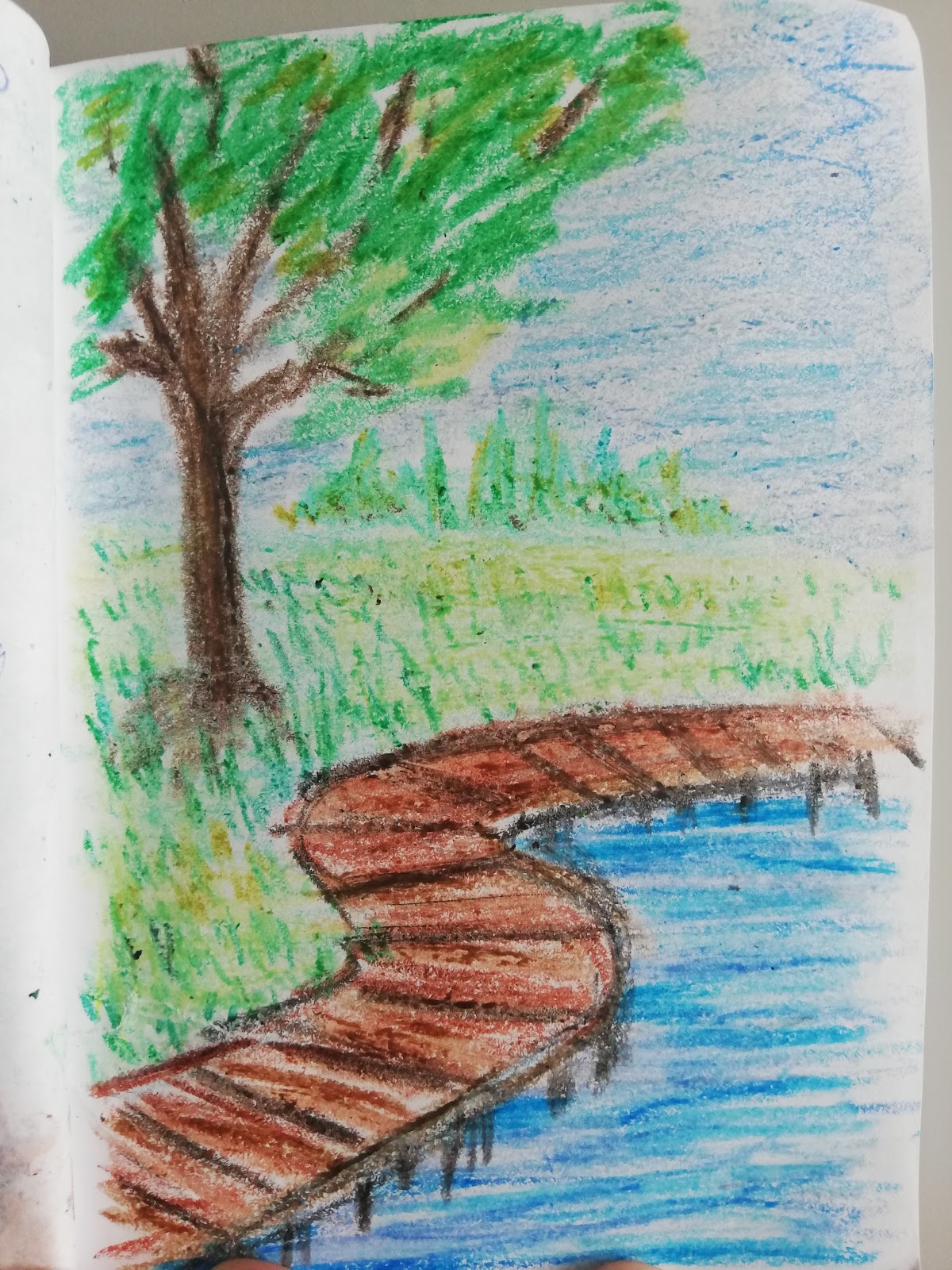 Wooden path. Done in crayons. Just to see what I could do with them. I wish my crayon skills were on par with LemiaCrescent from youtube, but I'm nowhere near her level. Still not gonna stop me from trying. Problem is, my crayons don't seem to want to layer. Oh well, I'm gonna be vacationing in the UK this year so I'm gonna try to get my hands on some art supplies that are not available in my country. Including some Crayola crayons, just to see if they really are better than what I have.
  This time, I took out just a normal pencil. And then I got inspired and decided to draw a tree while watching some "how to draw" videos on youtube. I love the fence. Yet, I'm a bit disappointed with the top of the tree. The rest of it is good, but the topmost part, not so much. Still, altogether, a nice sketch. Well, not a sketch, a drawing this time. Too detailed to be a sketch. For once.
 Another tree done in pencil. This one can and will be classified as a sketch. I did not spend enough time on it to be anything but a sketch. Still like how it turned out. Love the shading of the branches and the tree trunk. Though I did almost tear through the paper with the pressure I was putting on the pencil. Well, that's what I get for using such a flimsy paper.
  Pants this time and it's a bunny. Mostly just an outline with a bit of shading in the darkest parts. And some flowers in the background. Oh, and he's green because I had some leftover green paint and didn't want it to go to waste.
  Peacock done in markers. Water-based markers, I must add. At least di did not use the flimsiest paper I had. The sketchbook this is done in has paper that is a bit sturdier. Not as good as my mixed media pad that I still haven't used, but better than the one I did the bunny on. Not that the bunny had problems, but you understand what I mean, don'T you?
 The problem with this was, even though the paper was of better quality, I still had some problems when I layered too much marker on top of each other. And then I started bitching about not having enough green shades. So the next day I went to buy some. And now I have a bigger selection.
 Moon valley. Done in markers mostly, but the moon is white acrylic paint that was half dry on the palette. I started this several years ago. And this year, I came back to it. It's in a book that has almost every page filled with an unfinished picture. There are a few that are already finished, but I'm honestly not sure if there are any empty pages left. Maybe one. But I don't know for sure. My prediction is that it will take quite some time to finish it. In most cases because I have zero idea what I was doing on some of the pages. Really, some of them have several random lines or similar and I have no clue what it was supposed to be...
 Elephant. In gray paint. Just a quick sketch. Wanted to try animals and had leftover black and white paint. Or maybe just black? I don't know. It could have been white for all I know. But I know I had leftover paint of some kind. I love how the elephant turned out. Also, initial sketch was done in pencil that was then partially erased with a kneaded eraser.
  Bell pepper. In yellow. Done in water-based markers. I love how it looks. Though again, the flimsy paper. I feared I would tear right through it. I didn't though. Love the shading on it. Like, I know it's not hyperrealism, but I still want to grab it and eat it! And now I'm wondering if it really is done in markers. Because I think it actually isn't. Or at the very least, it is a combination of paints and markers. Still, looks great and I love it.
  An Owl. Hoot hoot. Well, not Hoot Hoot. That would be a pokemon. Done in paint and colored pencils. Really like how it looks. Though if I wanted, I could go back into it and make it a lot darker and more saturated. I won't, though. I think I like it the way it is. So why mess with something that works, right?
  Who left a burning candle right next to a book? Done in pencil initially. But then I decided to add some color and took out my oil pastels and giocondas. I mean, who doesn't like blue fire. I sure do. So I added mostly blue, but also some black and gray for shading. And for the record, the photo doesn't do it justice. It looks kinda better in real life. I guess it's because the photo is not lying flat and is not front and center... I'm not taking another one!
 Horse. Don't know why. Maybe as a homage to my horse phase when I was younger? There was a time when I would draw a lot of horses of any kind. And I still like them, but I'm no longer so crazy about them. That's what I get for entering a dragon phase.
 Tuesday, March 10, 2020
Various buildings
 This first one, I don't even know what the heck this is. I know I had inspiration from Pinterest again. I get a lot of inspiration from Pinterest. As well as youtube. However, I really don't know where I was going with this. I keep thinking it's not finished but then I always change my mind and decide that it really is finished. So, make of it what you will. I'm done with this picture. Washing my hands off of it.
  A window. Where it leads, no one knows. It's, after all, boarded up. And with some greenery growing around it. I like how it looks. The colors and then the black outline in certain parts. I really love how it doesn't outline everything perfectly. Done in paints. And now, that I'm looking back at it, I think I could have gone in with a lot more green paint. Could have mixed in a lot more shades of it. But I'm not gonna do that anymore. Not with the black already added. Should have realized it before that. Oh well, lesson learned.
  This one was inspired by a Pinterest pic of a Tuscan window. I tried to do something similar but I can safely say that theirs turned out a lot better. I mean, I like the flowers, sure, but the rest of it, it looks horrible. Still, it was good practice. I'm not gonna get better if I don't practice. Right?
  A tower top. In golden color. Reminds me of some of the Russian palace towers. Done in markers. And the background was then blended a bit using water. Which, only possible because these are water-based markers. I do have some alcohol-based ones, but the color palette is really limited. Yes, it would have been enough for this picture, but not for many others. And half of them are dry anyway. Well, maybe not yet, but I haven't used them in a while. So who knows... Still, I'm happy with this picture. I love this style of pics.
  Last one in this post. Another tower. This was the first time I tried experimenting with adding the lineart after doing the paint. And yes, the roof is all over the place, but other than that, I think the experiment was successful. Yes, it's not my best work, but hey, it was mostly for the experiment. And not much else. I do like it though. Maybe not as much as the previous pic (the golden tower top), but I do like it.
 Sunday, March 1, 2020
A bunch of Lighthouses
 This first one is done with paint. At first, I was trying to do it the correct way for watercolors - layer, layer, and layer, but then I said: "fuck it" and went in with some more concentrated colors nad been done with it. At the very end, I added the line art and the crows. It is, in the end, just a quick sketch inspired by a Pinterest post, but I do like how it turned out. And maybe I should just re-type what I wrote next to in on the other page. As I, lately, am prone to do.
  Second lighthouse. This one done on a small format page. Like, a quarter of an A4 paper. And a really thin one at that. I did an initial sketch with a red pen. One that is not erasable. And then I was going in with paint. Lately, I've been using a lot of paint. And I have to say, I really like how the cliffs turned out. The lighthouse itself could use a lot more work, but hey. I was worried I would tear through the paper, it really was thin. All in all, the cliffs are better than the lighthouse itself, but not too bad in general. Especially for such a crappy paper and a quick sketch.
 Last one. This one is done on an A4 paper. Again, thin paper, but layered with acrylic primer. Don't know why I then used markers of all things, but hey, it worked. Frankly, in real life, it looks way cooler, but even the photo is not too bad. Though it is probably not visible much, there are white dots of paint all over it to give it a bit of a magical feel. Out of the three lighthouses, I like this one the best. I also spent the most time on this. So no wonder I like it. Like, I still didn't spend too much time, but out of the three, this one took longest. So what do you think?
~AnnElfwind
Subscribe to:
Posts (Atom)
-
 I just couldn't resist writing about this. It was pure chance I stumbled across the description of this short movie, well, Marvel One...
 -
 Two new pictures. The first one is done in blue. Don't know why. But I felt like doing something that would not be in pencil but didn...