 |
| Yes, it is a yellow and blue horse. Deal with it. I'm actually very happy with how this one turned out. Done in markers and some colored pencils in my crappy sketchbook. Enjoy. ~AnnElfwind. |

...cause what's the world without hell...
|
| Yes, it is a yellow and blue horse. Deal with it. I'm actually very happy with how this one turned out. Done in markers and some colored pencils in my crappy sketchbook. Enjoy. ~AnnElfwind. |
 |
| I have started this years and years ago. And then finally I decided to finish it. It is a mix of markers and colored pencils. Hope you like it. ~AnnElfwind Written on the 8th of March, 2022 |

You will need:
 |
| And no, I'm not talking about the book (or movie) of the same name. Even though I had to read the book some years back for school. It wasn't a bad book but it wasn't exactly my cup of tea. So, this pic. Done in pencil over some sketch that looks like it's green? No, wrong. The green came later. I started with a pencil only. But then came the green and the roses. Hence it's called Rose Garden. |
 |
| This is totally based on a sketchbook idea from a youtube video. The background is a gradient done with some markers. Can't remember if they were alcohol or water-based though. The rest of it is done in pen. And it hated me. It kept dying on me. Even still, I love the final result. |
 |
| And again, I have a redraw of an old pic. Actually, I decided to redraw a lot more of them. They have (most of them) great ideas, but a lot of the time, the execution just doesn't do the idea justice. So I'm redrawing a whole bunch of them. Enjoy. ~AnnElfwind Written on the 16th of May, 2021 |

~AnnElfwind
Written on the 10th of January, 2021

Done in brush markers. Mainly black, but also gray and white. The lightest areas were shaded over with a pencil. It was darkened after I took a photo of it because the photo looked too light compared to the actual pic.
~AnnElfwind
Written on the 10th of January, 2021


Got two new pictures. This first one is a winter sol... Nope. Not Barnes. A winter warrior/demon. Yes, something like that. I'm insanely proud of this pic. I made it with mostly water-based markers. And I abused the hell out of that paper. It definitely isn't meant for such heavy blending and layering of something water-based. The hardest part was mixing a lip color that wouldn't be too feminine. I don't think I had the best colors for that. But! I managed. I managed to not make a female out of it. So yeah, super happy about it. Kekekeke! Apart from water-based markers I also used some acrylic paint. Mostly white for highlights and then blues and some white for the background and after, I used white again to make the snow? effect. I'm still not sure it's snow. It wasn't supposed to be snow. But meh. Let it be snow if it wants to be snow. Who am I to tell it what it can or cannot be, right?
So yeah, insanely proud of it and I hope you like it too. I found inspiration for it on Pinterest. I think I also had an art-related youtube video playing while I was drawing it. So, yeah. Inspiration galore. Tell me what you think.

This next pic is a Samurai. Again, inspired by Pinterest. But a lot more loosely. Originally, his left (from his perspective) hand was supposed to be visible, but I, stupidly, drew in permanent medium and did the hakama/kimono/whatever you call it first and well, you can't do it on top of it. I would have had to glue a piece of paper over it or something and well, I didn't have a paper with the same slightly yellow tint to it, so I decided to alter the anatomy and simply move the hand out of the frame, so to speak. His other hand has a single finger visible on the hilt of the katana. Simply because it was supposed to be there but it simply wouldn't fit. I misjudged the size I was drawing at. So yeah. Total miscalculation on my part.
The pic is done in water-based markers again with colored pencils having been used on the skin. I did this with my 'other' water-based markers and those don't have many skin tones. Also, I used and abused the hell out of my pale-blue Tombow alcohol-based marker. But only because I forgot I actually have a pale-blue water-based marker... Silly me. And now I have two as I bought a second one today, thinking I didn't have one. And, apparently, Czech Republic now has POSCA pens. I saw 'em in the local art supply store and had to buy the white one. I'm gonna use it for highlights instead of always busting out my acrylic white. It's a 0,7 tip and I think it will be perfect for the highlights. Can't wait to use it!
~AnnElfwind
Written on the 11th of August, 2020


 So, two new pics. Seems like I'm only posting pics... Well, I'll see if I can come up with something else soon. But for now, you'll have to deal. So, this first one is of a flower, well, a bunch of flowers. I had this old sketch that had some green on it in the shape of a stem and some leaves so I decided to do something about it. And took my markers and looked up some pink-ish flowers. Because pink was the first marker I grabbed. And there were these, lilies I think they are called. I think it is a species of lilies. And if not, they are now. And while they were arranged differently in the picture, I decided I would take them and reuse them for my pic. So, this is the result. The background is just a wash of watercolor with a bit of a blue marker at the bottom. The rest is done in markers and the highlights are done in white acrylic paint marker. I'm not really happy with the stem, but the flowers are really good. I like how they turned out. What do you think?
 Second one. This one is made with a reference from Pinterest. Only, the reference was male. So how the heck did this turn into a bloody female?! I don't even know. I think it's the mouth. Probably. I would have erased it and redone it, but I did this in markers. Alcohol markers. Tombow markers to be exact. And well, you can't really erase those. So a she-elf it is. Still not happy about that. But nothing I can do about it. I did not pre-sketch this with a pencil. I just took my three Tombow markers, the only three I own, and went right in. I have a black one, dark gray and a really light gray. So I decided to try them out. Finally. I mean, I swatched them when I got them, but that was about it. And now, I have a finished piece done with them. And apart from the gender of this elf going haywire, I really liked working with them. Guess I should get more of them. Well, we'll see when the store opened. Here, where I live, I know only about one single store that sells them and I'm not sure it's already open what with the COVID virus... Bloody thing... Ruining everything. Well, anyway, hope you like the drawing and I'll see you later. Bye.
 Yeah, I'm not taking the post name back. Nu-uh! I like it. Because that is precisely what this is. And this first one is a fish. Don't even remember why it is a fish. But I like it. It's simple yet looks kinda good. Excuse the pencil on the side, there was another drawing beside it and the fish would be cropped if I cut it off. So I left it. I'm thinking I could have done more with the weeds and corals, but I just wanted a bit of a different color there and the main focus be the fish, so it is what it is. I still like it. What do you think?
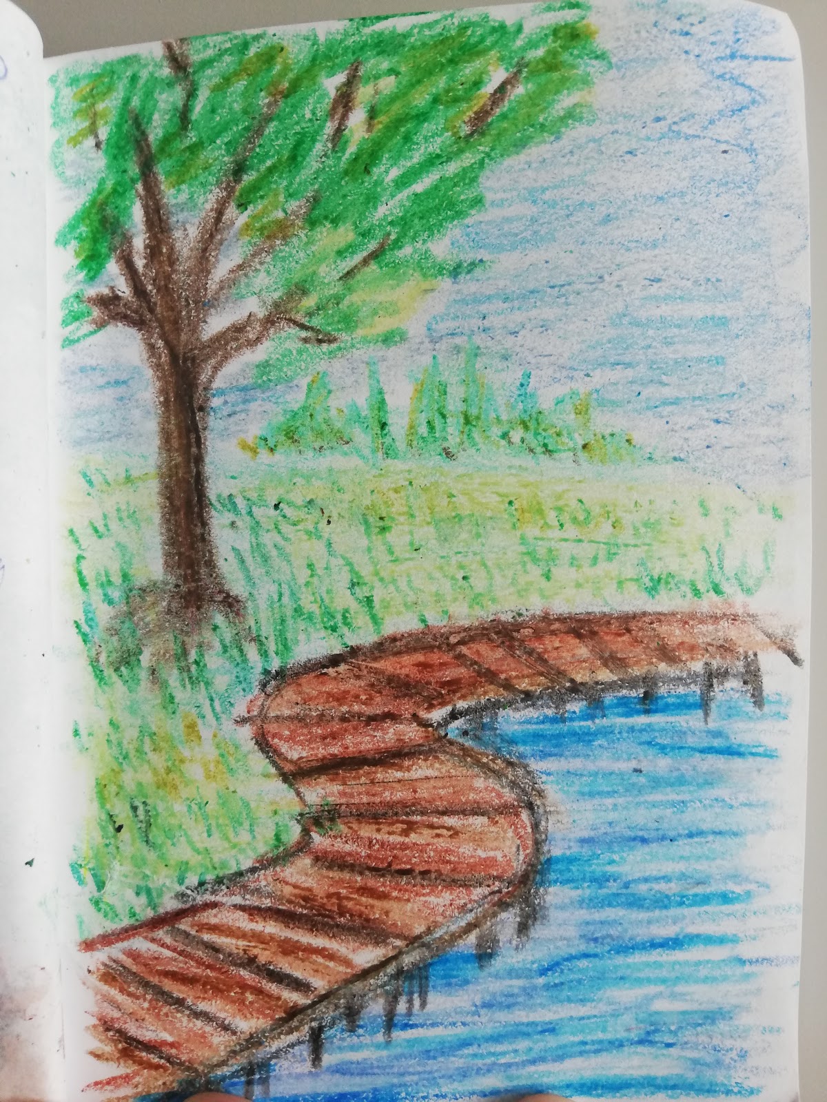 Wooden path. Done in crayons. Just to see what I could do with them. I wish my crayon skills were on par with LemiaCrescent from youtube, but I'm nowhere near her level. Still not gonna stop me from trying. Problem is, my crayons don't seem to want to layer. Oh well, I'm gonna be vacationing in the UK this year so I'm gonna try to get my hands on some art supplies that are not available in my country. Including some Crayola crayons, just to see if they really are better than what I have.
 This time, I took out just a normal pencil. And then I got inspired and decided to draw a tree while watching some "how to draw" videos on youtube. I love the fence. Yet, I'm a bit disappointed with the top of the tree. The rest of it is good, but the topmost part, not so much. Still, altogether, a nice sketch. Well, not a sketch, a drawing this time. Too detailed to be a sketch. For once.
 Another tree done in pencil. This one can and will be classified as a sketch. I did not spend enough time on it to be anything but a sketch. Still like how it turned out. Love the shading of the branches and the tree trunk. Though I did almost tear through the paper with the pressure I was putting on the pencil. Well, that's what I get for using such a flimsy paper.
 Pants this time and it's a bunny. Mostly just an outline with a bit of shading in the darkest parts. And some flowers in the background. Oh, and he's green because I had some leftover green paint and didn't want it to go to waste.
 Peacock done in markers. Water-based markers, I must add. At least di did not use the flimsiest paper I had. The sketchbook this is done in has paper that is a bit sturdier. Not as good as my mixed media pad that I still haven't used, but better than the one I did the bunny on. Not that the bunny had problems, but you understand what I mean, don'T you?
 Moon valley. Done in markers mostly, but the moon is white acrylic paint that was half dry on the palette. I started this several years ago. And this year, I came back to it. It's in a book that has almost every page filled with an unfinished picture. There are a few that are already finished, but I'm honestly not sure if there are any empty pages left. Maybe one. But I don't know for sure. My prediction is that it will take quite some time to finish it. In most cases because I have zero idea what I was doing on some of the pages. Really, some of them have several random lines or similar and I have no clue what it was supposed to be...
 Elephant. In gray paint. Just a quick sketch. Wanted to try animals and had leftover black and white paint. Or maybe just black? I don't know. It could have been white for all I know. But I know I had leftover paint of some kind. I love how the elephant turned out. Also, initial sketch was done in pencil that was then partially erased with a kneaded eraser.
 Bell pepper. In yellow. Done in water-based markers. I love how it looks. Though again, the flimsy paper. I feared I would tear right through it. I didn't though. Love the shading on it. Like, I know it's not hyperrealism, but I still want to grab it and eat it! And now I'm wondering if it really is done in markers. Because I think it actually isn't. Or at the very least, it is a combination of paints and markers. Still, looks great and I love it.
 An Owl. Hoot hoot. Well, not Hoot Hoot. That would be a pokemon. Done in paint and colored pencils. Really like how it looks. Though if I wanted, I could go back into it and make it a lot darker and more saturated. I won't, though. I think I like it the way it is. So why mess with something that works, right?
 Who left a burning candle right next to a book? Done in pencil initially. But then I decided to add some color and took out my oil pastels and giocondas. I mean, who doesn't like blue fire. I sure do. So I added mostly blue, but also some black and gray for shading. And for the record, the photo doesn't do it justice. It looks kinda better in real life. I guess it's because the photo is not lying flat and is not front and center... I'm not taking another one!
 Horse. Don't know why. Maybe as a homage to my horse phase when I was younger? There was a time when I would draw a lot of horses of any kind. And I still like them, but I'm no longer so crazy about them. That's what I get for entering a dragon phase.
 This first one, I don't even know what the heck this is. I know I had inspiration from Pinterest again. I get a lot of inspiration from Pinterest. As well as youtube. However, I really don't know where I was going with this. I keep thinking it's not finished but then I always change my mind and decide that it really is finished. So, make of it what you will. I'm done with this picture. Washing my hands off of it.
 A window. Where it leads, no one knows. It's, after all, boarded up. And with some greenery growing around it. I like how it looks. The colors and then the black outline in certain parts. I really love how it doesn't outline everything perfectly. Done in paints. And now, that I'm looking back at it, I think I could have gone in with a lot more green paint. Could have mixed in a lot more shades of it. But I'm not gonna do that anymore. Not with the black already added. Should have realized it before that. Oh well, lesson learned.
 This one was inspired by a Pinterest pic of a Tuscan window. I tried to do something similar but I can safely say that theirs turned out a lot better. I mean, I like the flowers, sure, but the rest of it, it looks horrible. Still, it was good practice. I'm not gonna get better if I don't practice. Right?
 A tower top. In golden color. Reminds me of some of the Russian palace towers. Done in markers. And the background was then blended a bit using water. Which, only possible because these are water-based markers. I do have some alcohol-based ones, but the color palette is really limited. Yes, it would have been enough for this picture, but not for many others. And half of them are dry anyway. Well, maybe not yet, but I haven't used them in a while. So who knows... Still, I'm happy with this picture. I love this style of pics.
 Last one in this post. Another tower. This was the first time I tried experimenting with adding the lineart after doing the paint. And yes, the roof is all over the place, but other than that, I think the experiment was successful. Yes, it's not my best work, but hey, it was mostly for the experiment. And not much else. I do like it though. Maybe not as much as the previous pic (the golden tower top), but I do like it.


